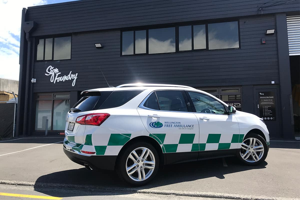
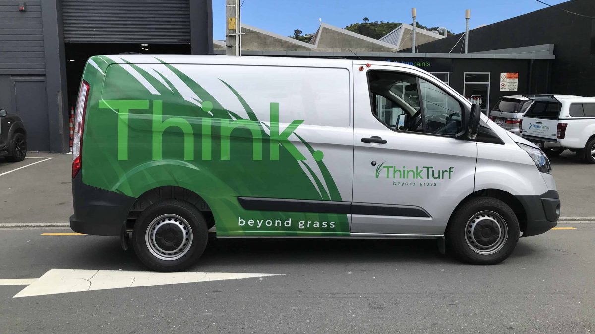
5 RULES FOR EFFECTIVE CAR WRAP DESIGN
A good car wrap design turns your work vehicle into an effective travelling billboard for your brand. Follow these five easy rules to get it right.
If you’re driving work vehicles around all the time, you might as well take advantage of the free advertising space and get your car wrapped. However, it goes without saying that not all vehicle wraps are created equal. Designing a good one requires an eye for the aesthetics of design, an awareness of marketing and branding concepts, and specific technical knowledge – understandably, it’s tricky to get it all right.
So you want to learn how to achieve a great car wrap design? A great place to start is by following these five simple rules!

DON’T MAKE YOUR CAR WRAP DESIGN TOO COMPLICATED
Keep this in mind: most people seeing your car wrap are only going to be seeing it for a few seconds as you drive past. That’s not a lot of time, so if your design is too complicated, a lot of it won’t be taken in. Simple, striking, and effective images or logos are effective as they are easily interpreted and stick around in a viewer’s memory. Complicated designs won’t.
KEEP ON YOUR BRAND’S MESSAGE
Much like a billboard, your wrap’s primary purpose should be to promote your brand. Think about this: if you wrap your plumber’s van with photos of pipes, will people who see it remember anything specific about your brand? Probably not – they’ll remember they saw a plumber’s van and will then end up with the first result on Google or the first entry in the Yellow Pages when they need a plumber. A prominent and well-designed logo, a good colour scheme and prominent placement of your company name are your priorities.
DON’T USE TOO MUCH TEXT
In the few seconds of view time someone has for your vehicle wrap, they won’t be able to read a whole list of text. The correct place for detailed information about your company is on your website, or perhaps over the phone – your wrap should provide enough info to direct people to these places and compel them to do so. Your company name is essential, a tagline is good if it’s on brand message, and contact details like a phone number or email address could be useful. For anything else, ask yourself if it’s necessary.
ONLY USE HIGH QUALITY IMAGES
Vehicle wraps are big – really big! Using images in your design that aren’t in a very high resolution can make your wrap turn out blurry or pixelated – an absolute no-no, since it screams unprofessionalism. One good way to ensure that your images scale well is to use vector-based designs. These are not images per se – mathematical information used to draw the design in real time is stored, making them infinitely scalable without losing quality. Where you must use images, make sure they are high quality.
GET THE RIGHT VEHICLE MEASUREMENTS
You’ll design your wrap using a template which shows where everything will go. There are a variety of templates for vehicles of different sizes and shapes, but it always pays to double and triple check your actual vehicle’s measurements to make sure they match. The actual printing can be very expensive, so you definitely don’t want to be doing it more than once.
Working on a car wrap project? This calls for a professional’s help.
HIRE US
If you want specific details on vehicle wraps, give us a call today or visit our website! We look forward to working with you to assist you with your vehicle wrap.
Concept Wraps provide all forms of vehicle wrapping services. Contact us today to get the best graphics and wrapping services for your vehicle.
Find out more vinyl wrapping works in our Instagram and gallery.

